

Simply Espresso
The Challenge:
Create a brand identity for a neighborhood coffee shop that feels inviting, local, and familiar.
While staying true to the name, the logo needed to be simple and bold, but still friendly. The overall visual system was designed to feel approachable and at home among the downtown Tacoma community.
Early concepts


Refined concepts




Final logo


Color
The colors I chose were cream, coffee black, and copper. To stay true to the name, these colors were simple yet its subtle enough to add warmth to the brand.
#1C1A18| 28, 26, 24
#F0EBDD| 240,235, 221
#9A5A3A | 154, 90, 58
Typography
Crimson Pro added a certain class that compliments the brand. Coming from an old industrial city, it felt necessary to have such an editorial typeface. To bring in readability and modernity, Work Sans brought the right taste for this brand without grabbing too much attention from the primary typeface.
Primary / Crimson Pro / Bold
ABCDEFG HIJKLMN OPQRSTU VWXYZ
Secondary / Work Sans / Regular x Light
ABCDEFGHIJKLMNOPQRSTUVWXYZ
ABCDEFGHIJKLM
NOPQRSTUVWXYZ
Mockups
Per client's request mockups were made to show how the brand would be applied in the products they envisioned. Below there's a style guide that was given to client to follow.


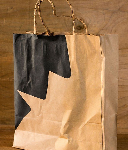
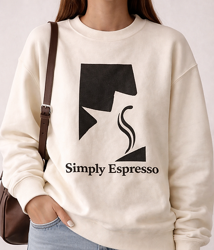
To make sure the brand stayed consistent, a style guide was created to define how the logo, type, and colors should be used.